Written exploration · UX teardown · 6 min read
One city. One app. Finally.
How Chennai One solved a problem I didn't know had a name, a UX teardown of the government transit app that quietly ended ten years of standing at a bus stop, guessing.
← Back to all workA personal essay, not a design project of mine. Chennai One is the Tamil Nadu government's unified public-transport app; this is my teardown of why its UX works, and what every Indian city could learn from it. The screenshots are from the live app.
The morning that started it all
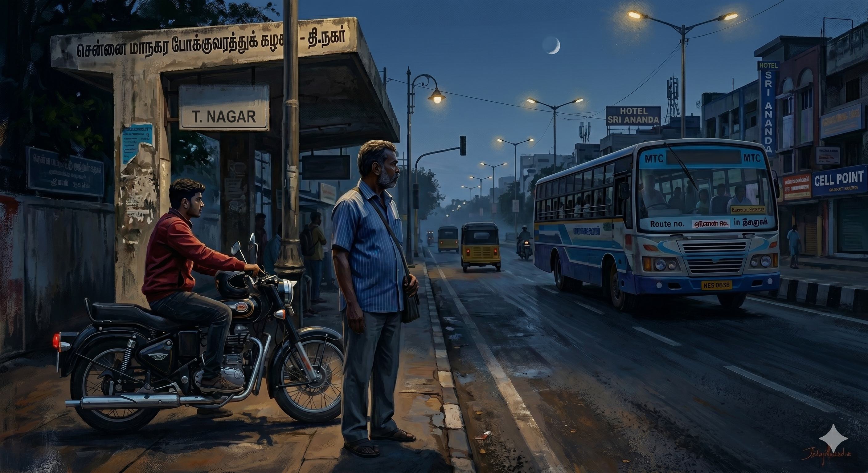
It was 4:30 in the morning. Dark, quiet, peaceful, the only sound was crickets. I started my bike and dropped my father at the nearby bus stop. He needed to reach Chennai Central by 6:00 AM for an outstation journey. His train wouldn't wait.
My father is an ardent public-transport commuter. He owns a bike, but if there's a suburban bus or train available, he'll always choose that. It's encoded in his DNA, I think.
We reached the bus stop at 5:01 AM. He said the first bus was at 5:00 AM. One minute late. That one minute was enough to fill my head with dread. If we'd missed the 5:00 AM bus, the next was probably 5:15, a 30-minute ride to Central, putting him there at 5:45, running through platforms, scanning boards, hoping the train was still there. No calm morning. Just panic from the first minute of the day.
We waited. Ten minutes passed. The bus arrived. Relief. He boarded, I rode home. But the uncertainty stayed with me the entire ride back. What if we'd been two minutes later? What if the bus had been two minutes early? There was no way to know. You just showed up and hoped.
This uncertainty wasn't new
Ten years ago, I used to travel by bus from Perambur to T. Nagar on the 29C. Missing a bus meant reaching college 30 minutes late, sweating, tense, and it would take half the day to get back to normal. Nothing had changed in ten years.
Then a friend sent me something
A government app, he said. You can book suburban train, bus, metro, and even a cab all in one place. My first reaction: scam. Or if not a scam, then something that looks exactly like IRCTC, fifteen icons on one screen, outdated architecture, no real utility for daily commuting. I installed it anyway, mostly out of curiosity.
The app opened. The name was Chennai One.
I genuinely thought I'd downloaded the wrong app. The UI was clean. Smooth animations. A map that felt alive. What struck me immediately was how familiar it felt, the same UX patterns I use every day on Ola, Uber, and Rapido.
The details that stood out
- Bottom sheets shaped like physical tickets: select a route and the booking details slide up feeling tactile and real, not like a form you're filling.
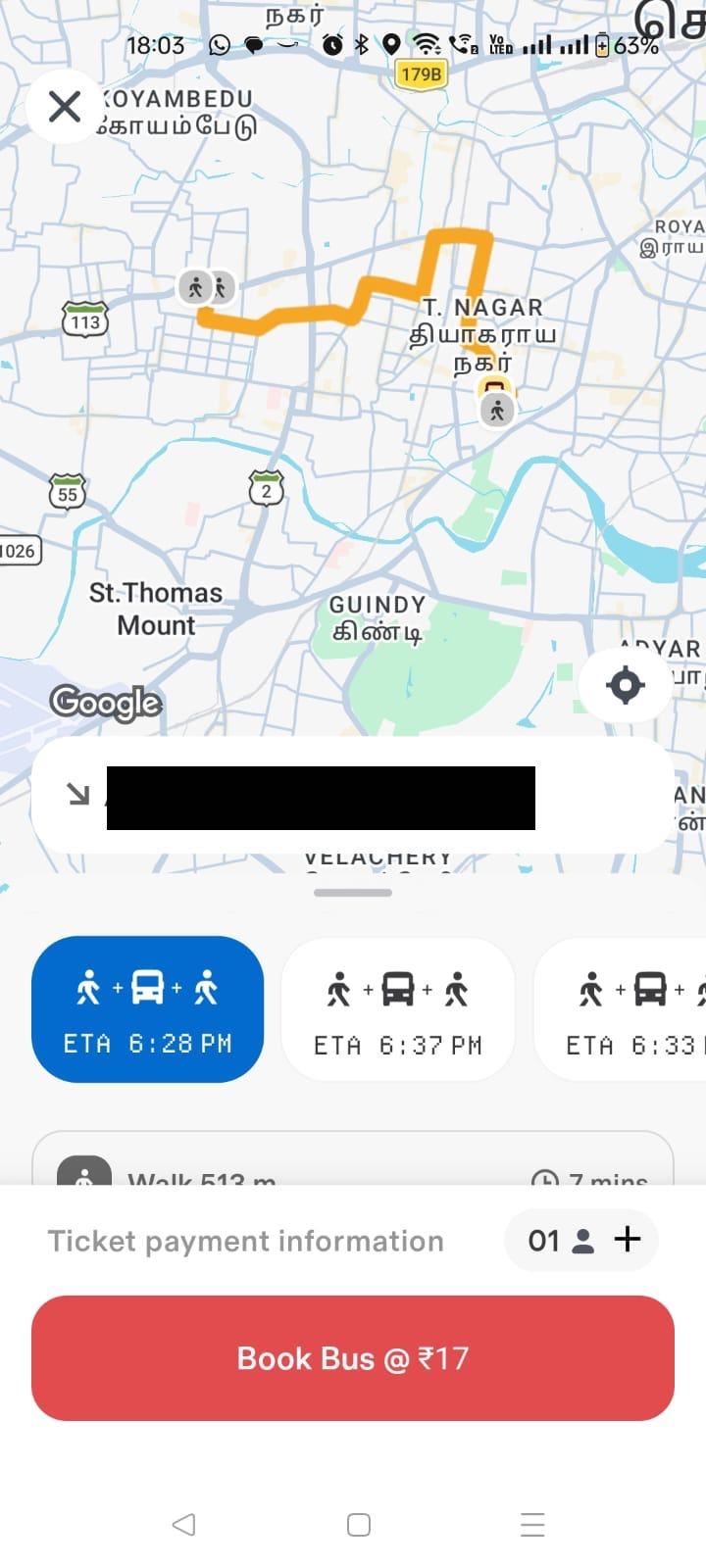
- Swipeable ETA cards: route options as horizontal cards with time and fare upfront. No dropdowns, no hunting.
- Colour-coded transport modes: Bus, Train, Metro, Auto each with their own colour on the home screen. Instant separation at a glance.
- Contextual floating buttons: BUS TICKET and BUS QR appear and change based on what you're doing. Clean, uncluttered.
- 3D bus illustration on confirmation: not just text confirming your booking, but a rendered 3D visual of the actual bus tier you booked. Deluxe in purple. Confirmation that feels satisfying.
Every one of these is a pattern borrowed directly from Ola, Uber, Rapido and Swiggy, apps this city uses every single day. That familiarity is not accidental. It's the reason someone like me, who installed it with full skepticism, felt comfortable booking within the first two minutes.
The real test
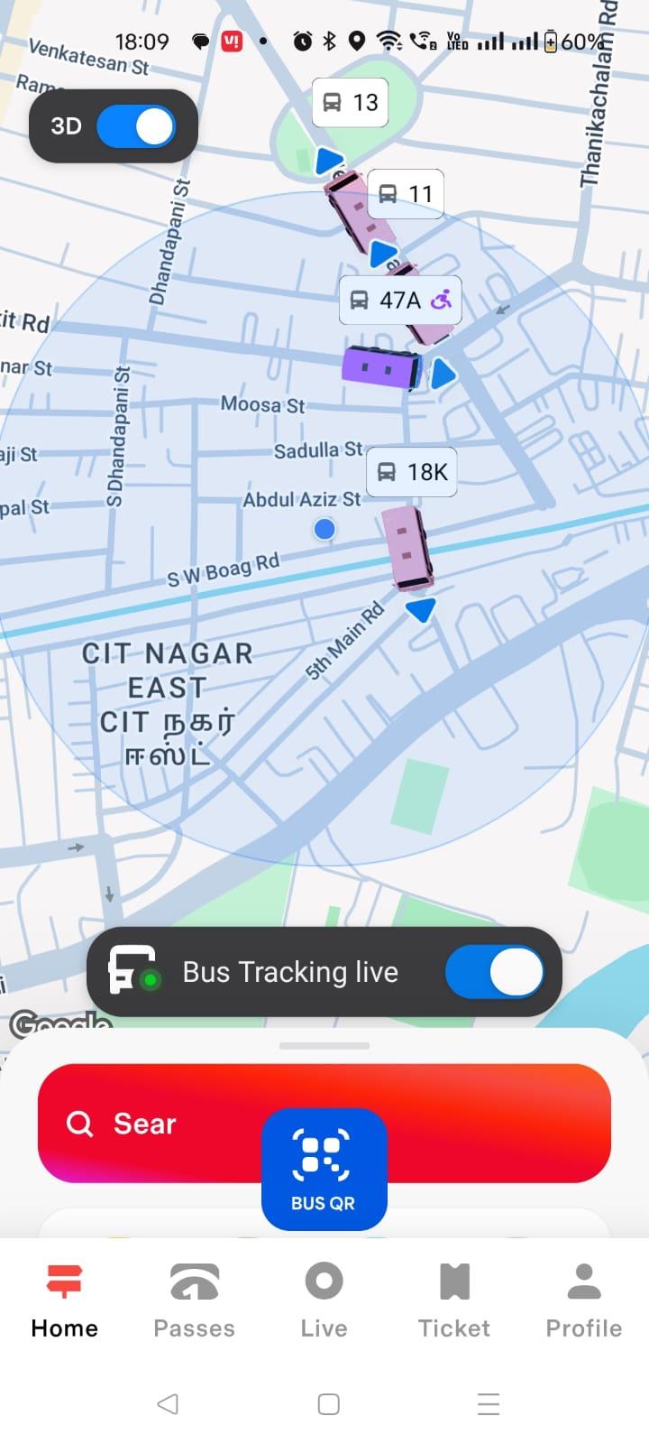
The next time I dropped my father at the same bus stop (same 4:30 AM, same uncertainty), I opened Chennai One. While booking the ticket I could see exactly when the next bus would arrive at our stop, how many stops away it was, the estimated time, the vehicle number. The bus appeared on the map in 3D, moving in real time, like watching an Ola cab approach, but for a public bus.
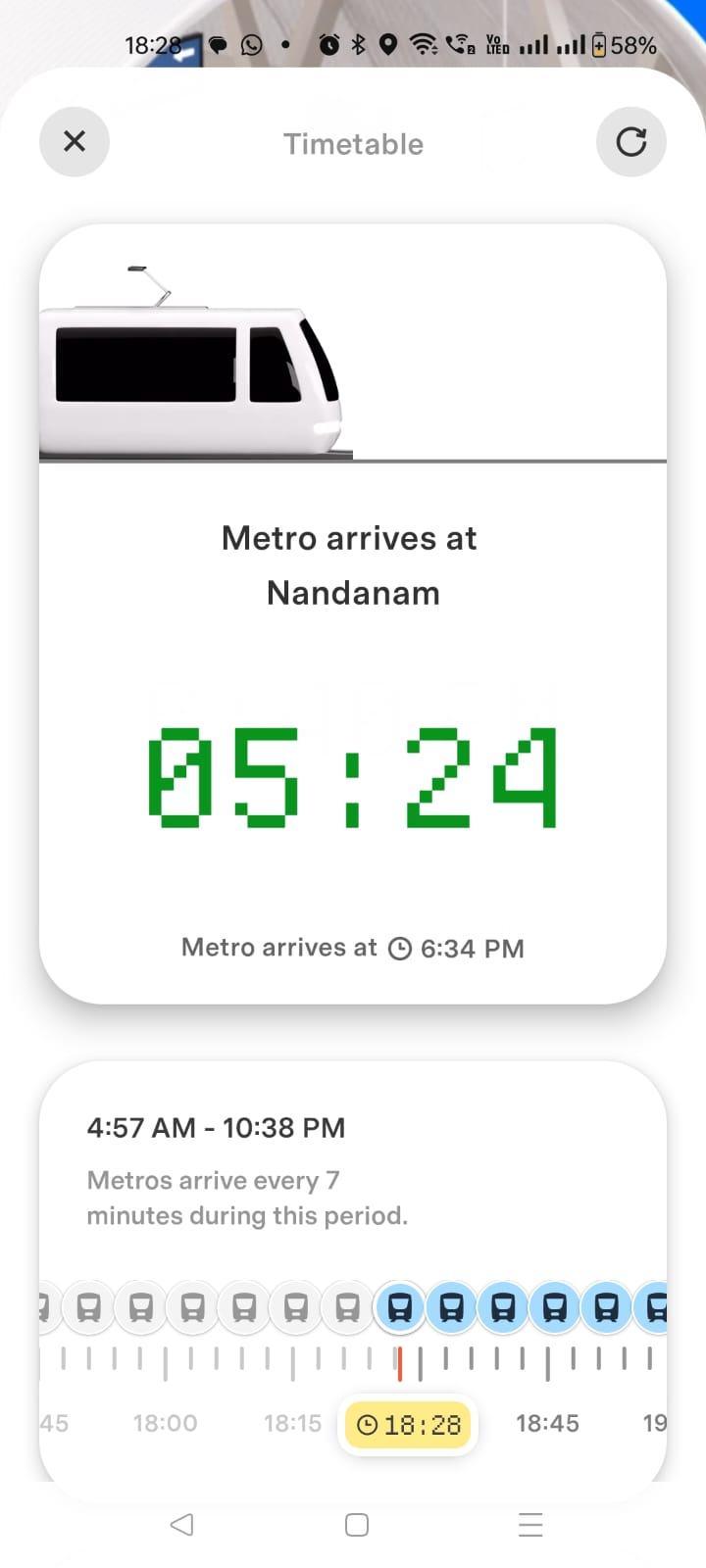
That one feature quietly dissolved ten years of uncertainty. No more showing up and hoping. I could see the bus coming. My father could leave home at the right time, board calmly, and reach Central with time to spare. Later, on the metro and suburban trains, the same clarity was there: next arrival, frequency, everything you need to actually plan instead of guess.
The detail nobody talks about
There's one more thing I noticed on the ticket itself: a countdown timer. It shows exactly how long the ticket is valid for. That small detail creates something powerful, a sense of ownership. You booked it, the clock is running, you plan around it. It's not just a ticket; it's a commitment that the journey is happening now. It pushed me to be on time rather than casual about it. The kind of micro-UX detail most people will never consciously notice, but they'll feel it.
What Chennai One actually does
Before this app, a Chennai commuter using public transport had to manage four completely separate systems:
- Suburban rail: the RailOne app (previously UTS, discontinued mid-use).
- City bus: no app at all. Buy a ticket from the conductor on board.
- Metro: the CMRL website, or a counter at the station.
- Auto / cab: Rapido, Uber or Ola, opened separately.
Chennai One puts all four on one screen. That unification isn't a feature. It is the product. Live bus tracking on the map in 3D with route numbers. Predictive stop arrival, not just where the bus is now, but when it reaches your stop, with three upcoming buses shown. Metro and suburban arrival times CMRL never showed, that users complained about for years, now visible right inside the app. Ticket flexibility, one bus ticket works for three more buses in the same tier, so missing your bus means no panic and no rebooking. And digital monthly passes, renewable inside the app, no counter visit needed.
What's still missing
Metro Pass is listed as Coming Soon. Until it's live, the one-app promise is only partly kept for metro users, a daily metro commuter still has to step outside the app to manage their pass. That one gap breaks the very promise Chennai One is built on.
What every city in India should learn
- Unification is the product. The individual features existed in pieces elsewhere. Putting them all in one place is the actual innovation.
- Listen to your users. Arrival times were a known frustration for years. Chennai One delivered them. That's not just product thinking, that's empathy.
- UX is a trust signal. A government app that speaks the same design language as Ola and Uber makes users feel at home immediately. Familiarity builds trust faster than any onboarding screen.
- Completeness is a promise. The metro-pass gap isn't a small thing, it's a broken piece of the one-app story. Get it all the way there.
Chennai One isn't perfect. But it proved something important: good UX in public infrastructure is possible. Someone just has to care enough to build it.
More work
See the featured case studies →